Turning the Threat to a Distant Glacier into a Local Story Through Data Visualization
In February, New York Times climate reporter Raymond Zhong and photographer Chang W. Lee joined a team of scientists on an expedition to Thwaites Glacier, Antarctica’s fastest melting glacier. Their story and data visualizations, published the following month as “How a Melting Glacier Could Affect Tens of Millions Around the Globe,” covered the research being conducted there and the political environment surrounding its funding.
The expedition’s main goal was to document a vulnerable glacier whose collapse would have dramatic global impact. After the expedition ended in February, the Times continued to report on the researchers’ findings. I spoke with Mira Rojanasakul, a graphics reporter and editor for climate and environmental stories at the Times, who wrote and designed the project.
This interview was edited for length and clarity.
How did this specific angle emerge within the broader Thwaites Glacier coverage?
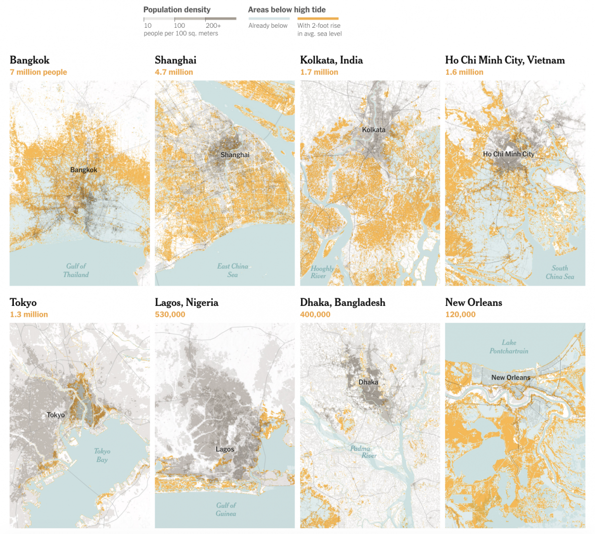
It might not look like it on the map, but [Thwaites Glacier] is enormous. It acts as a cork in the bottle. If it collapses, much of the surrounding ice will too, and Thwaites alone would be responsible for about two feet on average of global sea level rise. The newsroom thought that fact was surprising and worth explaining. We wanted to bring that home to readers and show how two feet, or more, would ultimately look along coastlines around the world.
Climate Central has done a lot of great work on this in the past. That earlier work helped spark this piece. For some cities, significant portions of the current population would be impacted, and we ran with that idea.
I went to WorldPop and updated different data layers. I also reached out to a Harvard researcher [Jerry Mitrovica] who explained how the northern hemisphere would see far greater impacts from sea level rise if Antarctica melts because Antarctica would have less gravity pulling ocean water toward it.
How did you decide which cities to include?
We created a spreadsheet with many cities but we wanted to focus on the ones that would see the biggest impacts. These are Asian megacities that have grown or are growing really quickly because they are located in deltas with lots of economic opportunities. As these countries urbanize, the level of risk and exposure has grown too.
Shanghai is unique in that a huge percentage of the land where these dense populations reside would be underwater, even though they’re currently behind defences. A lot of these coastal places have protections, but it isn’t fool-proof and it’ll have ongoing costs and concerns going into the future, too, as sea levels rise and storm surges push the sea levels well beyond the average at times.
In data visualization, design choices impact how the audience perceives or engages with the data presented. How did you approach those design choices?
Maybe because I have a fine art background, a lot of my process is really just trying different things and squinting at it and seeing what feels right. It’s not a particularly scientific approach. But I also just try to get a lay of the landscape in terms of what different colors signal to readers.
For a while, we tried a darker blue for the places within two feet of average sea level change. There have been a lot of maps that do something similar. But I really wanted to stay away from the idea that these places would definitely be inundated. There’s a lot of uncertainty embedded in these maps. We’re only looking at a melting Thwaites scenario. But there are existing coastal protections. People could move. So orangey-yellow felt more like a way to signal risk.
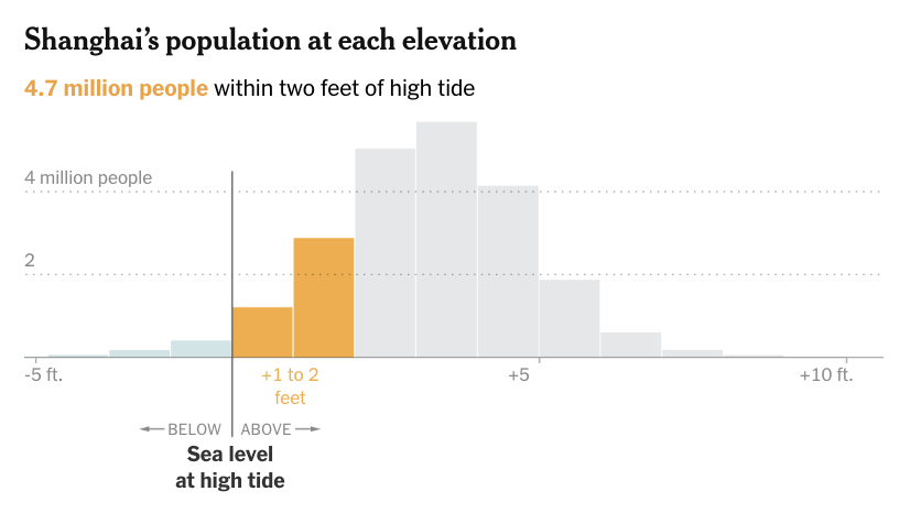
Tell me about the histograms showing population distribution. Were there other iterations of those?
Histograms are a little bit more challenging for readers than a map might be. I love them because you get to see really clearly this clustering of populations really close to low elevations near the coastline. That was a pattern for a lot of those global cities we saw time and time again. I wanted to pair them with the map so they reinforce and feed off of each other.
Did you create more versions of these during the reporting process?
As part of the reporting exploration process, I churned these out for hundreds of cities. That’s the magic of code. I find that’s a nice way to see if the pattern you’re looking at is widespread and help select examples for the piece.
Examining regional differences in sea level rise was a new angle compared to other articles I’ve read about sea level rise. Was this something that you knew going into the story, given all the research you’ve done? Or did this angle reveal itself as you did more reporting?
Definitely a little bit of both. A few years ago I worked on a piece about land subsidence — a huge factor in a lot of these delta cities — so I was aware of that going in. Sea level rise is one of the clearest ways to understand climate change and how that’s going to impact populations. But because it can seem more slow-moving, attention is moved away from it.
Where land elevation and water elevation meet is actually an interesting data challenge. Depending on what data set you use, you might be working with an averaged land elevation model. Luckily, the elevation data we used from Climate Central reflects local water levels more accurately.
Across the various stories you’ve worked on as a graphics editor, is there something that you have to think about or do differently for environmental stories?
Since joining the climate team [from a more general graphics team], I think the reporting process changed for me. I’ll start a story and then spend a week or two just trying to understand an entire field to feel confident in writing just a couple sentences or paragraphs about one thing. I feel like that’s the biggest challenge, but also something I really like to do.
Why are graphics so crucial for climate-related stories?
Hannah Fairfield was the person who put this team together. She has a visual background so visuals have always been central to the reporting that the New York Times climate team did. A lot of it is bringing home these big abstract concepts and faraway impacts to the reader in a more local way.
What makes a visualization stick with an audience or impact their understanding of climate science and policy?
Data visualization can personalize a story by geography more easily or more impactfully. You don’t have time to talk about every single state in words, perhaps, but we can show that in a graphic. Design and visualization can signal readers to approach a story more analytically, where they want to sit down and study it, in a way that words alone can’t necessarily do. We want to give people various entry points into the same nugget of a story to meet audiences where they are or where their interests might lie.
One of my criteria for approaching a data story is how comprehensive the dataset really is. If we get a chance to say something bigger, or put something into that larger context that people can explore, that’s often a pretty big deal to readers. People are really interested in finding out what’s happening where they live.
The post Turning the Threat to a Distant Glacier into a Local Story Through Data Visualization first appeared on Storybench.