How Copernicus Makes Climate Data Simple and Easy for You to Understand
Each January, journalists around the world cite the same source when reporting on the planet’s temperature: the annual climate visuals from the Copernicus Climate Change Service.
The graphics are authoritative, widely reused, and strikingly calm. They avoid alarmism while still conveying urgency. Many are interactive. Some are built in accessible tools like Datawrapper. Others rely on Python. All of them balance scientific rigor with public clarity.
Behind much of this work is Dr. Anna Lombardi, a data visualization specialist at the European Centre for Medium-Range Weather Forecasts, which runs Copernicus’ climate monitoring efforts.
We spoke with Lombardi about how these visuals come together, how she thinks about tone and trade-offs, and what journalists often get wrong when visualizing climate data.
This conversation has been edited for length and clarity.

When you begin working on annual climate visuals, what’s the first decision you make?
We always start from the data and the scientific analysis behind it. At Copernicus Climate Change Service, we publish several products, including annual global climate highlights, a European State of the Climate report, and monthly bulletins tracking key climate variables such as temperature, precipitation, and sea ice.
The first step is understanding what the data is telling us. I work closely with scientists in the team who analyze the findings and identify key messages. At the same time, we need to think how to best communicate such findings to our audience, which is very broad and includes journalists, policymakers, scientists, and the general public.
These visuals are often shared beyond scientific audiences. How do you design for people who may not regularly engage with climate data?
A chart has to be clear and accurate. Many charts will be taken out of their original context and shared independently on social media or news outlets, so they need to be self-explanatory.
We try to identify one key message for each chart and make that very clear in the visual itself, but also through words, in the title and extra annotations. That’s the first layer of information.
Then we provide ways for people to explore further. We include open data behind each chart for transparency. With interactive graphics, users can hover on individual data points to access additional information. We try not to overwhelm users at first glance, but extra context is there if they want to explore, at their own pace.
Climate datasets are massive. How do you decide what to leave out?
It all comes down to thinking about the users and what you would like them to take home as a key message
For example, we once had a dataset containing a lot of information about heatwaves in Europe, which were ranked by severity. We could have shown a table with all these values, but instead we used a scatter plot with bubbles to clearly show the ranking by adding a colour gradient.
The ranking is the key story. But when you hover over each bubble, you can see extra details like duration and maximum temperature.
There’s always a trade-off. You show the headline message first, and then provide context behind it.
How do tool choices factor into your workflow?
When I joined the team, all charts were hard-coded in Python and were static. I brought experience using Datawrapper, which is very user-friendly and responsive, and we began introducing more interactive graphics.
This year we also introduced Flourish to bring in scrollytelling: this can be really useful to guide the reader through all the complex findings of a report. For infographics and more designed products, my go-to tool is Adobe Illustrator.
We still rely on Python, especially for maps, because the datasets behind them can be very high-resolution and heavy..
So it’s a mix. Accessible tools where possible, and coding where necessary.
From the outside, this work looks very technical. How much of it is coding versus editorial judgment?
Across the team, I would say it’s about a 50-50 split.
For example, I’ve automated the update of a few charts behind our climate monthly bulletins using the Datawrapper API, so they update automatically when new data is released. That’s coding.
But design decisions — structuring the chart, writing clear titles, adding annotations — those are editorial judgments.
I focus mainly on visualization, but I collaborate daily with scientists who have the final word on scientific correctness of every graphic we publish.
When you see climate data visualized poorly, what mistakes stand out?
When it comes to visualizing climate data, there has been a massive improvement in recent years, especially in major newsrooms. The quality standard is now really high. From time to time we still see a few mistakes, including some confusion over reference periods , misleading color choices, and scaling errors.
For example, sometimes dots are sized incorrectly by diameter rather than area, which can exaggerate differences. I’ve also seen wildfire maps where dots were enlarged so much that half a continent appeared to be on fire when in reality it wasn’t.
To use axes that don’t start at zero can be a conscious choice to better show trends, but it risks to be misleading if not clearly explained within the chart. Transparency is key.
You’ve worked in both newsrooms and scientific institutions. How does working inside a scientific organization shape your design decisions?
I started as a scientist, completed a PhD, then worked five years as a data and visual journalist at The Times and Sunday Times in London before joining Copernicus.
I love working inside a scientific organization, it feels like the perfect meeting point between my previous careers . At ECMWF I found a very welcoming and collaborative environment. I’m given a lot of freedom in design choices and experimenting with new ideas and visualization products and I have the amazing and enriching opportunity to collaborate and learn from some great scientists..
Climate visuals can easily become alarmist or emotionally flat. What do you think about tone?
It’s a delicate balance.
We try to avoid being alarmist, both in color choices and in text. Our goal is not to scare or overwhelm people, but to give them the information they need to make informed decisions. If communication is too alarmist, people often tend to switch off. We need to convey the message that it’s not too late to take action. Constructive communication is more effective in the long term.
Many Copernicus graphics are reused by newsrooms. Do you design with reuse in mind?
Yes, the media is one of our key audiences.
We try to anticipate journalists’ questions and include that information directly in the chart. We use explanatory titles, avoid unexplained acronyms and point out significant peaks or events in annotations. Text is always a key part of our graphics.
Since refining our approach, we’ve received fewer clarification requests from journalists. Often they republish the charts as they are. That’s very rewarding.
What advice would you give students or journalists intimidated by the technical side of climate data?
I was intimidated at first, too. For me, learning technical skills is easier when I have a clear objective, a clear project in mind. I very rarely start from a manual. If you’re genuinely curious about a dataset and want to answer a specific question, you’ll find a way to learn what you need. There are amazing tools and tutorials online, and the dataviz community is a very open and friendly environment where to find resources and advice.
A Visual That Stands Out
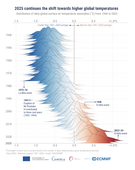
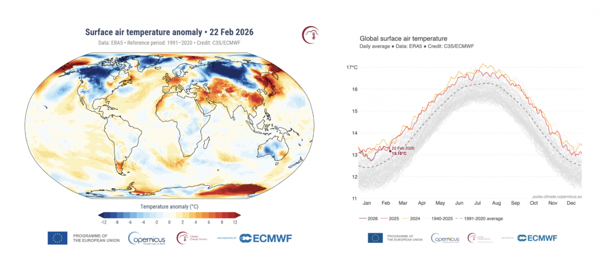
When asked which 2025 visualization best captures her approach, Lombardi pointed to a mountain temperature graphic showing intensifying warming over time, a static visual – which was inspired by the work of the BBC journalist Erwan Rivault – and that unexpectedly went viral.
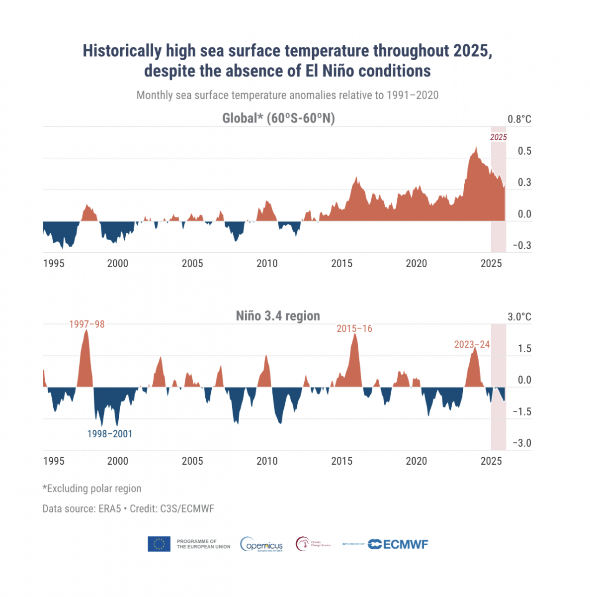
She also highlighted a small-multiple chart showing record global sea surface temperatures in 2025, despite a mild La Niña phase.
“You can explain all that in words,” she said. “But when you see that red line at the top, it just speaks for itself”.
The post How Copernicus Makes Climate Data Simple and Easy for You to Understand first appeared on Storybench.