A bit more context with: Philip Bump
I’ll admit that I sometimes find as much value in a bad chart as in a good one.
A good chart tells you something about the data. A bad one tells you something about its creator, offering an opportunity to explore the mistakes — or motivation — that led to the broken presentation before you.
Sometimes the motivation is clear, as was the case with an animated chart that President Donald Trump shared on the social media platform he owns over the weekend.
After flipping rapidly through a month-by-month look at cumulative inflation over presidential terms, it ends here, with this presentation.
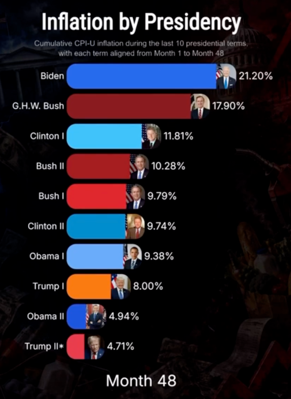
When it comes to inflation, the chart claims, no one has seen lower levels than Trump himself in his second term. So much for that narrative!
Except, of course, that assessing the cumulative inflation by the 48th month of Trump’s second term is a bit tricky, given that we are some 30 months from that marker. The chart spends most of its time comparing inflation under other presidents’ full terms to the inflation Trump’s overseen so far, which is like praising a football team for its perfect record two games into the season.
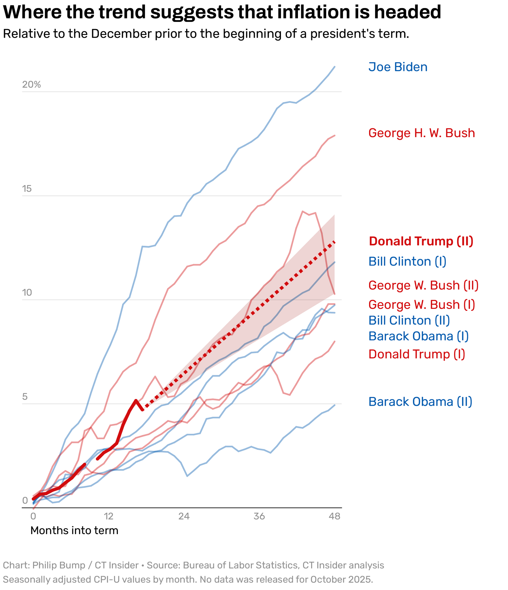
If we plot the cumulative inflation for each president as a line chart, allowing us to see every point at once, it looks like this.
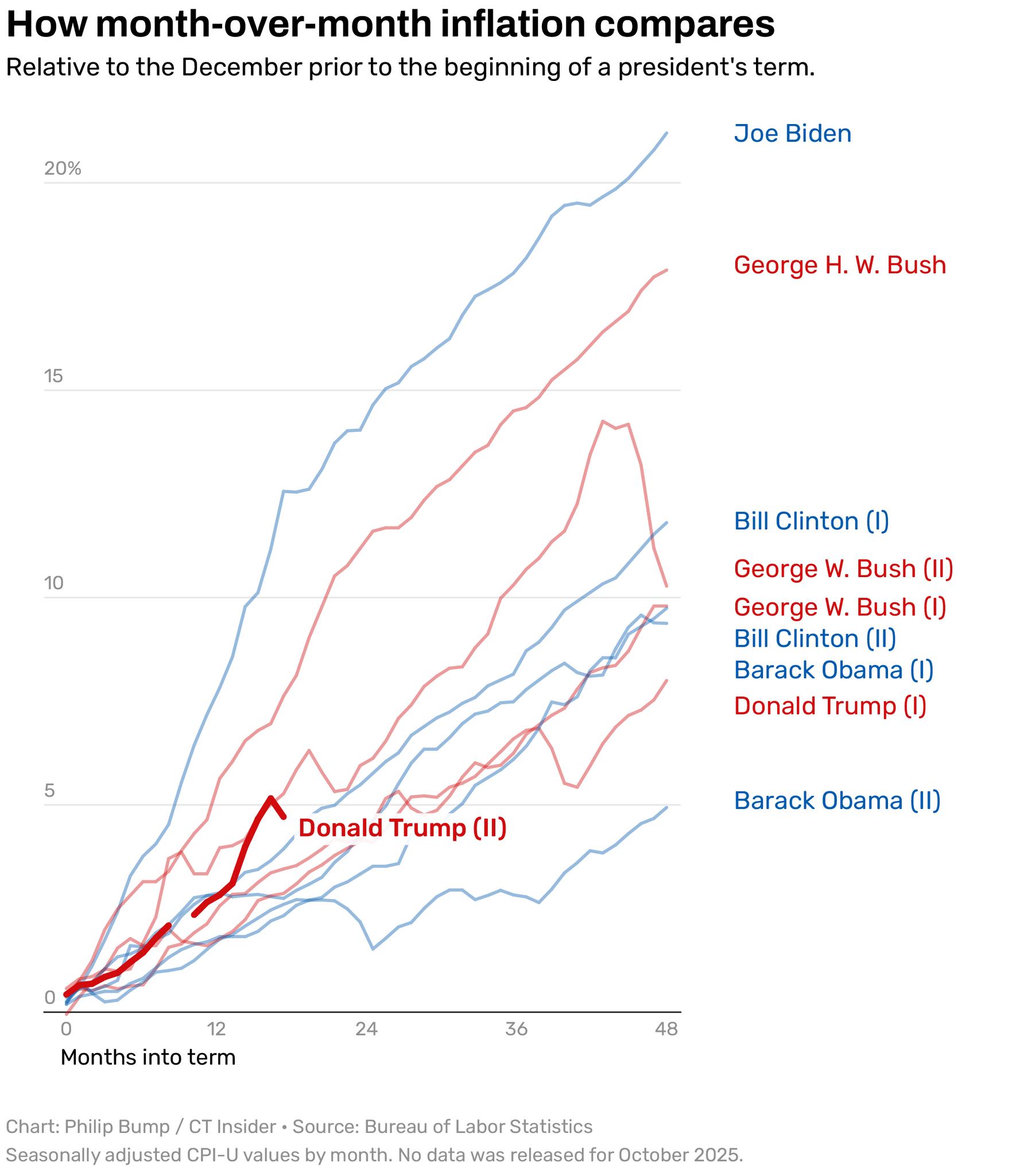
Yes, Trump’s seen lower inflation than his peers … so far. (I could raise other methodological quibbles, mind you, like comparing change to the December before each president took office, which is odd since they begin in late January, but we might as well focus on the most egregious example.)
If we look at the cumulative change in inflation in each president’s tenure to this same point, the picture is different.
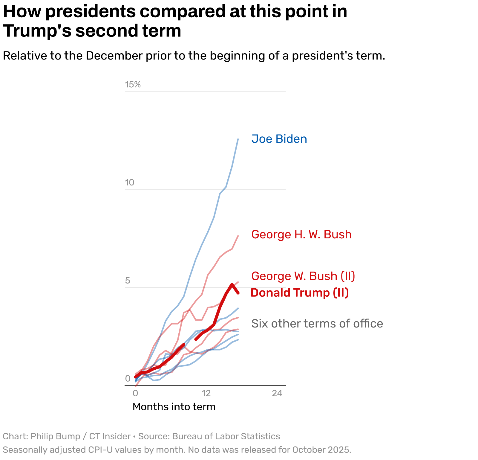
Now, Trump’s second term is close to the top.
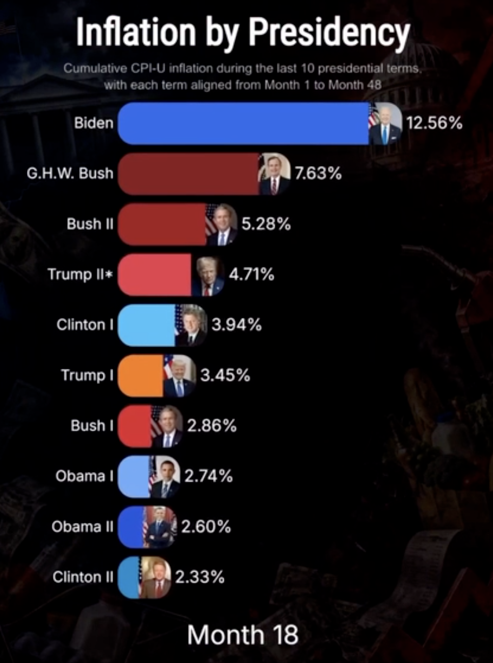
In fairness, the animated chart Trump shared (but almost certainly didn’t create) does show this point as well. But it flashes by only for an instant. The majority of the animation shows the asterisked Trump II bar sinking slowly to the bottom of the table as all of the other presidents, burdened by the passage of time, rise above him.
We can make a guess at where inflation could actually be by the time a new president is inaugurated in January 2029. If the average monthly rate increase that’s occurred over the course of Trump’s second term continues, cumulative inflation would likely land somewhere between 10% and 14%, putting his term somewhere among the five with the highest cost increases.
And, immediately afterward, an even bigger frustration for the inflation-conscious president: a new chief executive who, right out of the gates, would have by far the most impressive performance on an animated chart like the one Trump shared. Their month 1 increase of however many points would sink rapidly to the bottom of the animation and stay there for the next 47 months — a tribute to their excellent stewardship of the economy.
Or, at least, a testament to the powers of misrepresenting data.
| Philip Bump, Senior data editor and columnist |

A few years ago, this publication had the opportunity to interview an author, a New Haven resident, on the occasion of the release of his new book.
He opined on his preferred pizza joint, as one does, and reminisced about his family’s history in the state. He’d spent quite a bit of time away from Connecticut — college at Harvard University and work in Washington, D.C. — but came back because he could avoid “the frantic scramble for real estate and educational advantage that we were sort of expecting to face” had he remained in the nation’s capital.
“I like New England landscapes,” he said. “I like the fall. I like faded industrial towns. I like taking my son, who is obsessed with pirates, to Mystic Seaport.”
Little did the author, Ross Douthat, know that his home state would soon experience what he described in his final New York Times column a few days ago as “civic and educational collapse.” Yes, here in Connecticut! The culprit? Democrat-led governance driven by “doctrinaire progressivism.”
|
|
|
|
|
Make the Most of Your Subscription